Marking WAB's 25th Anniversary
Designing a scalable identity system that balanced cultural symbolism with production realities
I. Background & Challenge
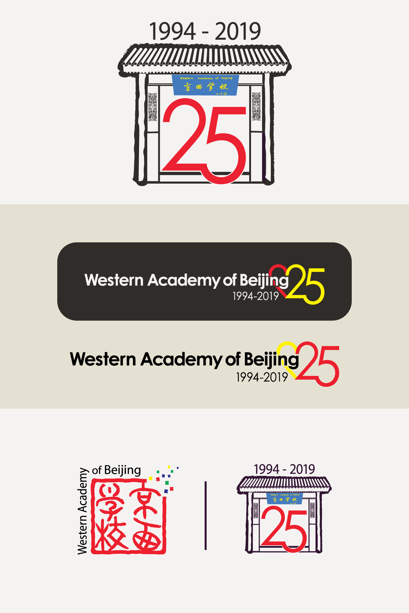
To celebrate its twenty-fifth anniversary, Western Academy of Beijing sought a new visual mark connected to its Chinese Garden, a culturally significant space on campus. The proposed direction centered on an ornate Chinese doorway, valued for its symbolism, craftsmanship, and connection to place.
The challenge was structural rather than aesthetic. What made the doorway meaningful (intricate carving and pattern work) resists simplification. The mark also needed to function alongside the school’s existing logo, which was illustrative and less conducive to modern scalability.
The identity needed to perform across a wide range of applications, from digital environments to merchandise, including very small formats. The core question: how to honor cultural meaning and institutional heritage while creating something that could function reliably in real-world use.
Challenge One:
Final design must depict the doorway to WAB's Chinese Garden.
Challenge Two:
Graphic must work well when presented with the main WAB Logo.
II. Strategy & Expression
Early in the process, it became clear that a single mark could not meet all requirements without compromise. Rather than forcing simplification that would dilute meaning, I developed a system-based approach.
The primary mark preserved the illustrative doorway, allowing its detail and symbolism to remain intact for expressive and large-format uses. In parallel, a simplified, iconic mark was developed to support applications where scale and reproduction constraints made detail impractical.
To unify the system, both versions featured the same stylized “25,” creating visual coherence across expressions. This shared element allowed the marks to function independently while remaining clearly connected.
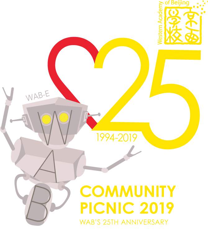
This approach allowed each expression to do what it did best. The illustrative mark carried narrative and place. The iconic mark ensured usability and consistency across constrained formats: merchandise, small digital assets. Expanded versions of the doorway illustration were also developed for commemorative and large-scale applications, extending the system without breaking coherence.
The result: an identity system that balanced meaning with function, tradition with practicality.


III. Reflection
This project highlighted a reality common to many schools: legacy logos and symbolic imagery often carry deep community meaning, even when they fall short of modern standards. The challenge isn’t to replace them, but to work around them thoughtfully.
When a community believes a mark reflects who they are, or remembers it as part of what brought them to the school, that meaning carries weight. Brand strategy, in this context, becomes an act of stewardship rather than reinvention. Small refinements to color, structure, or usage can improve clarity without breaking trust.
This experience reinforced the value of flexible systems as a way to respect heritage while enabling growth. It continues to shape how I approach school branding: less about creating perfect marks, more about designing systems that allow institutions to evolve while remaining recognizable to the communities they serve.