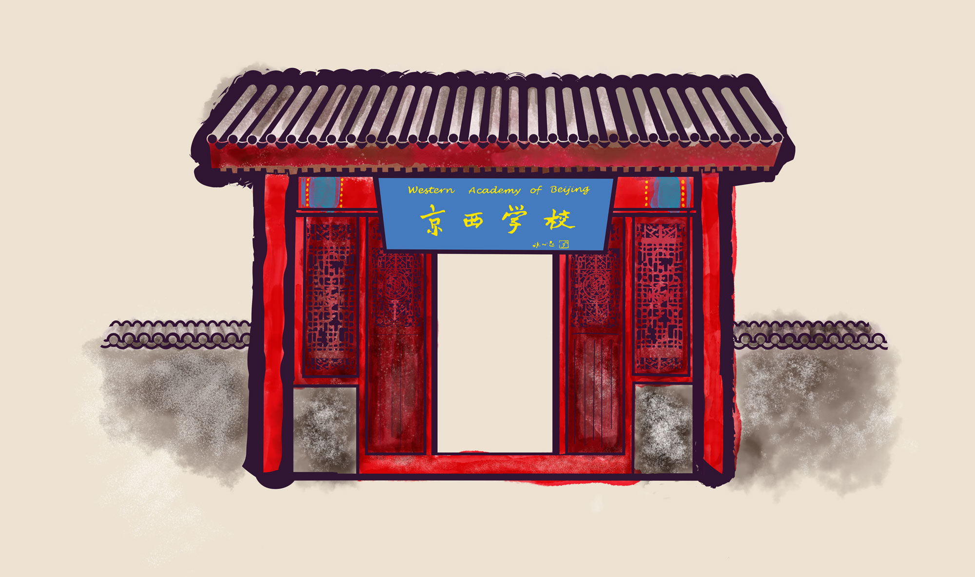
For WAB’s 25th anniversary, I designed a commemorative identity built around the school’s Chinese Garden doorway. The community was attached to that doorway for a reason I only fully understood later: it was an old factory door from WAB’s original campus. It carried real history, which is exactly why people wanted it front and center.
The challenge The problem was that the door did not want to be a logo. Its beauty is in its intricate carving and pattern, and that detail resists simplification. It also had to work alongside WAB’s existing logo and perform everywhere from large banners down to the smallest merchandise.
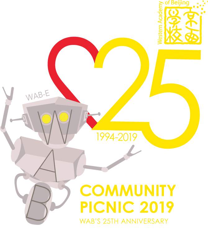
The solution: two marks Rather than forcing one mark to do everything, I built a system of two. The primary mark preserved the illustrative doorway in full detail, honoring the history the community cared about. A second, simplified mark handled the small formats and tight applications where detail breaks down. A shared stylized “25” linked the two, so they could work independently while clearly belonging to the same family.