I led a comprehensive brand strategy at Western Academy of Beijing, running custom workshops with every part of the community: students, teachers, leadership, parents, and the board. That research and alignment process formed the foundation everything else was built on.
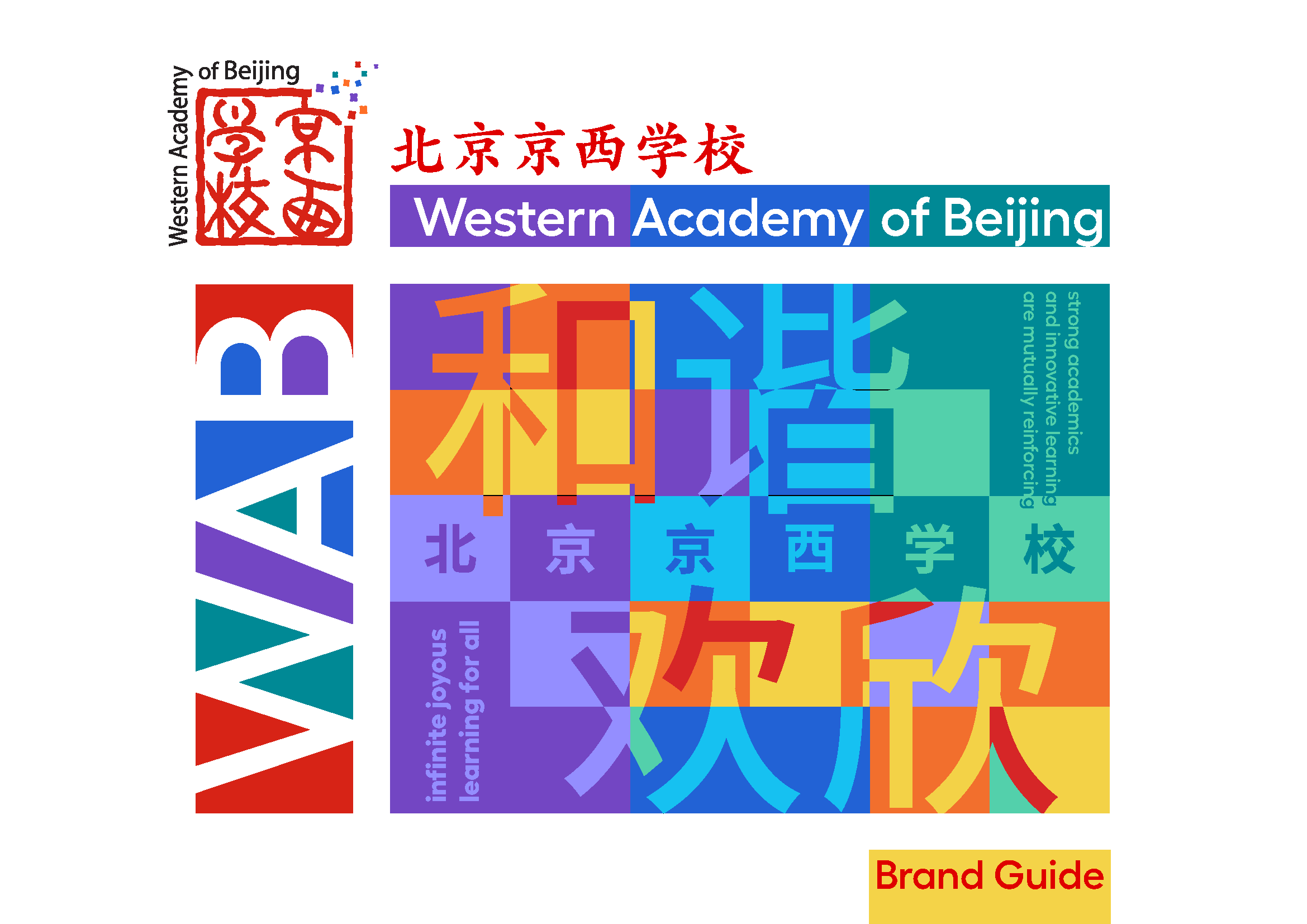
The strategy centered on a joyful harmony of learning at WAB. That idea shaped the color direction directly. I brought in a harmonious triad of purple, blue, and teal to balance the school’s existing red and gold, giving the identity more range without losing its roots.
The visual system was developed in close collaboration with MEAT Studio Beijing. They professionalized the graphics and built a grid system that made consistent design achievable for everyone on campus, not just trained designers. This brand guide was the culmination of that effort.


