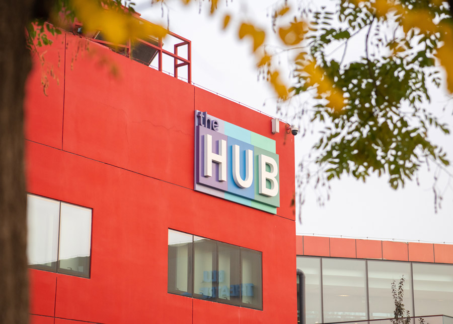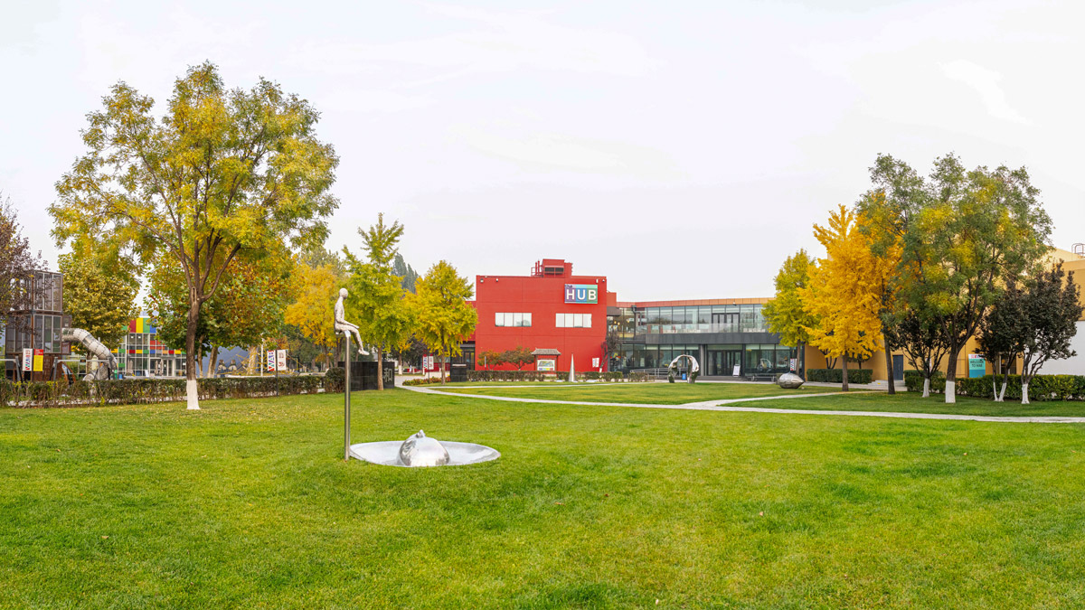
Following completion of the brand strategy, the website became the first major implementation priority. This was intentional. The site was the most visible expression of the school and the primary touchpoint for prospective families worldwide.
Working closely with Finalsite, I ensured the new site reflected both the strategic framework and the refined visual system. The updated color palette was bold and expressive, requiring disciplined application to avoid visual inconsistency. During this process, the geometric pattern system, later formalized in the Brand Guide, began to take shape as a structured way to balance color and cohesion.
Navigation and audience clarity were central goals. I introduced an audience toggle feature that allowed prospective parents and students to access tailored content within the same learning-level pages. This shift moved communication from institution-centered to audience-aware.
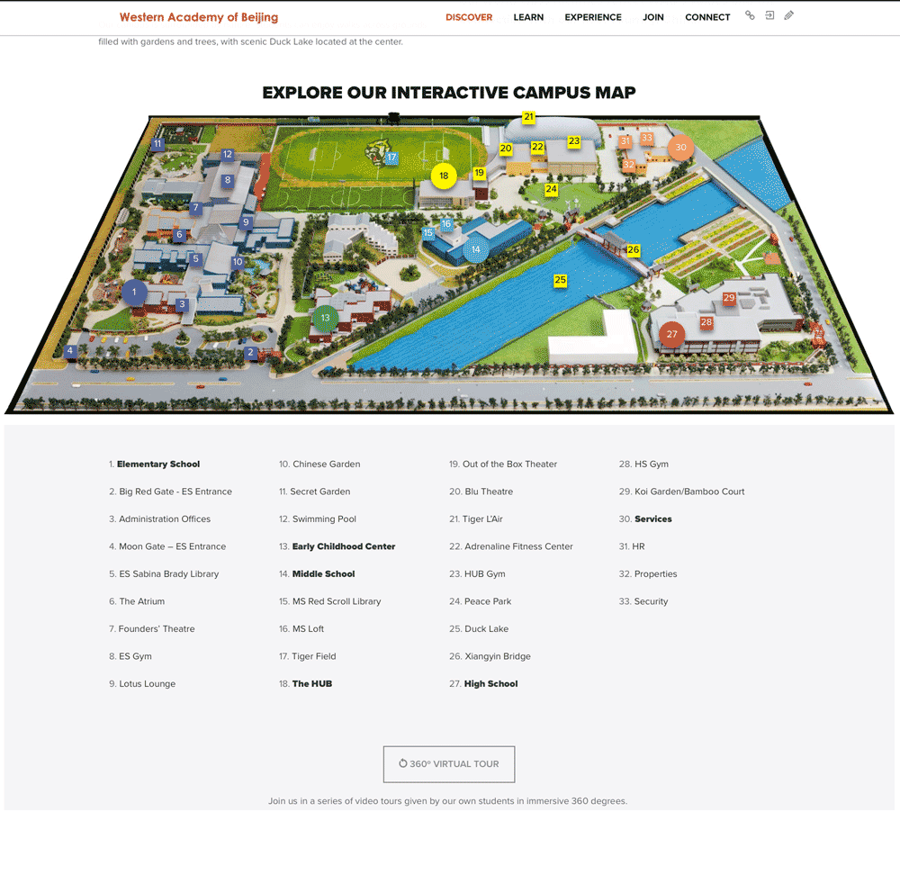
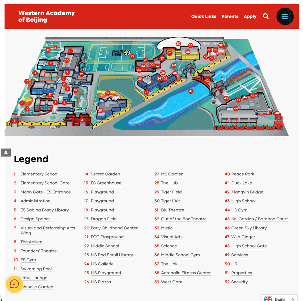
I also developed supporting graphics and illustrations for the site, including a new campus map (above) that aligned with the updated color system and reinforced brand coherence.