The School ID Visual System
Designing a modular identity system rooted in strategic clarity
I. Background & Challenge
The School ID visual system was developed as a direct expression of its Core Brand Strategy. From the beginning, conversations with school leaders made one thing clear: they valued authentic, connecting stories over decorative design. Visuals alone do not create trust. But when aligned with strategy and audience insight, they can clarify and reinforce it.
Branding in schools is not primarily about selling. It is about strengthening belonging and aligning communities around shared purpose.
I developed the visual system to make School ID’s Brand Srategy visible and usable. At the same time, it needed to function as a modern, scalable system, one capable of working across digital platforms, presentations, documents, and workshops while consistently reinforcing clarity, structure, and coherence.
The challenge was to design an identity that demonstrated to school how their story could be shown as both disciplined and human.
School ID was founded to help international schools articulate authentic brand identity.
The visual system needed to express the strategy and demonstrate it in practice.
II. Strategy & Expression
I built the School ID visual system favoring strategic framework over aesthetic preference. Before sketching logos or selecting color palettes, I clarified the core structure of the brand through the OWL Model, short for Ongoing Watching and Learning, a framework that aligns identity, audience, and long-term positioning.
The OWL Model establishes the foundational elements of the brand, articulates its central promise, and defines how that promise lives within the community it serves. It ensures that every visual decision can be traced back to strategic intent.
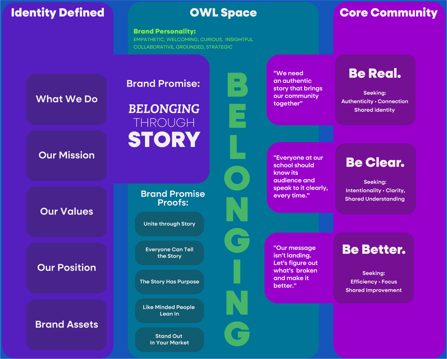
The OWL Model, Ongoing Watching and Learning, is School ID’s strategic backbone. It defines:
-
Identity and foundational truth
-
The central brand promise
-
Proof points that bring the promise to life
-
Core community motivations
-
Ongoing dialogue between brand and audience
The model positions brand as a dynamic system shaped through community understanding. The visual identity reflects this modular, layered structure.
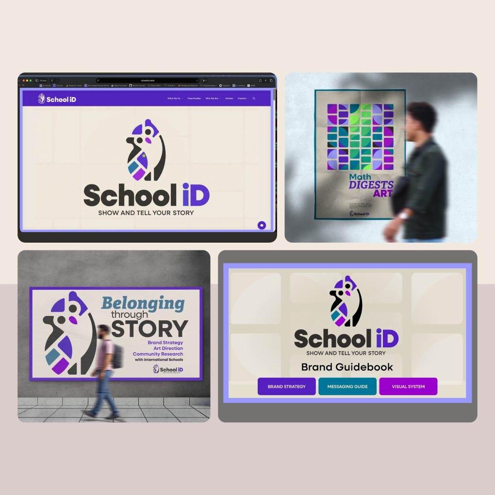
Visual System Overview
Logos
I designed the logo system as a modular family. Each variation reflects the structured, block-based logic of School ID’s strategies .
Rounded corners soften the geometric forms, balancing structure with approachability. This choice reflects the brand’s personality, disciplined but human.
The system allows the identity to scale across contexts while maintaining cohesion.
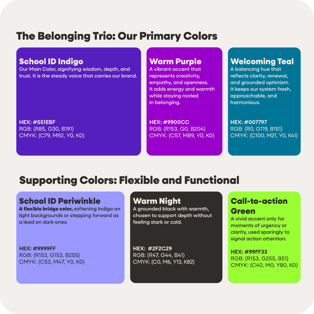
Color
I built the color system around what I call the Belonging Trio, three core hues that anchor the identity. Purple leads as the primary color, signaling clarity and thoughtful authority, while the supporting tones create balance and visual harmony.
I developed the colors to reflect personality and interact well with each other.
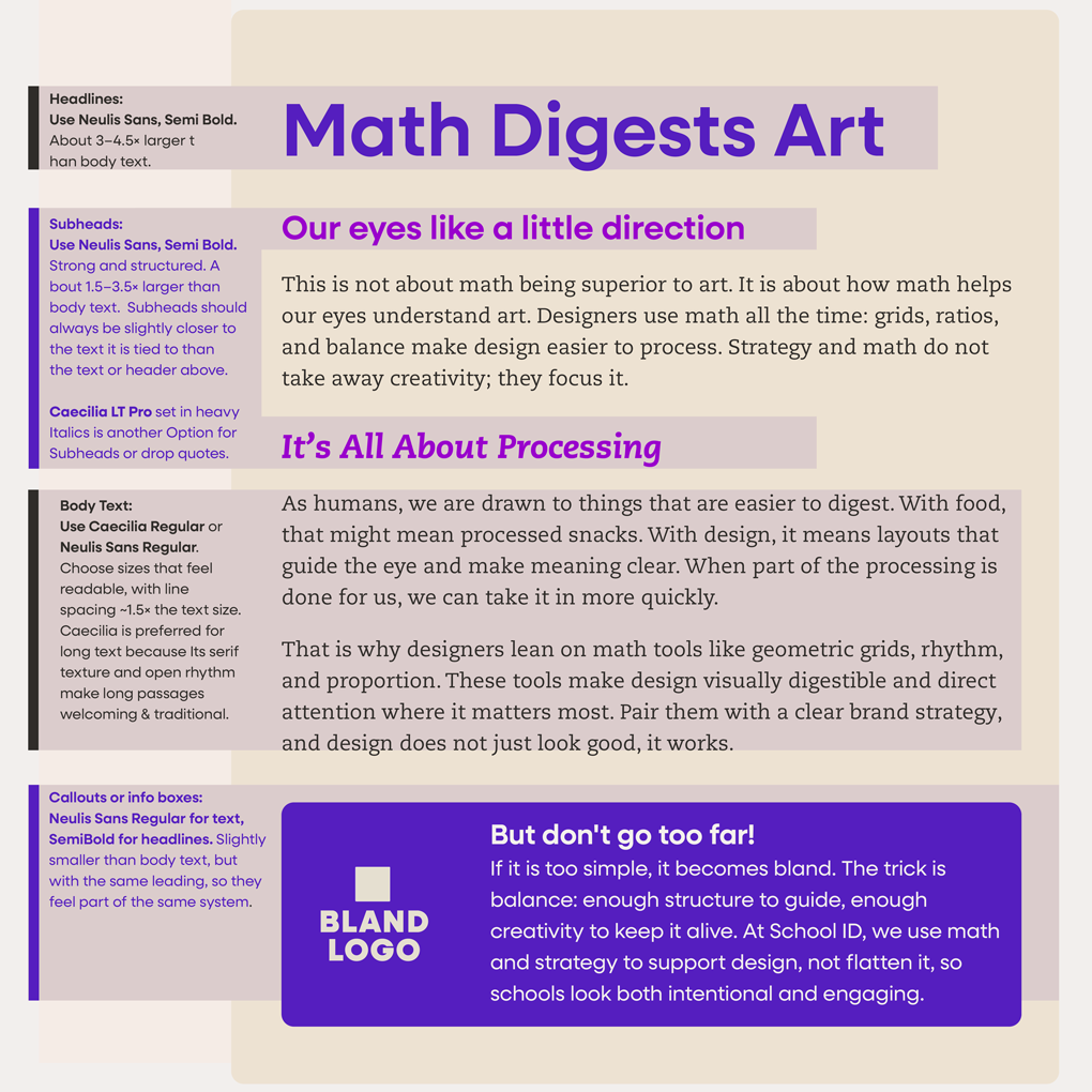
Typography
I selected a typographic system that balances geometric structure with academic warmth. The primary typeface, inspired by Bauhaus principles, reinforces clarity and modernity. A complementary serif introduces depth and scholarly credibility, grounding the system in the context of education.
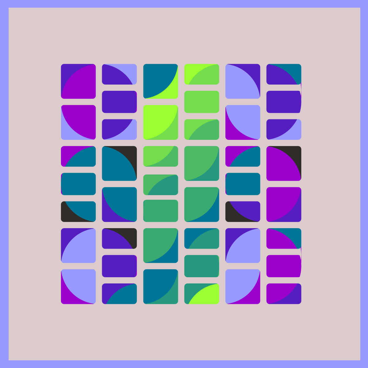
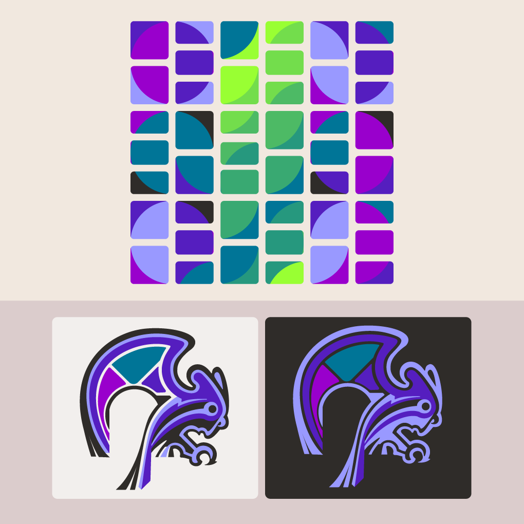
Illustration
Illustrations reinforce the system’s modular logic rather than introduce a separate visual language.
The block-based graphic portrays the system as structural, visualizing strategy in modular form. All corners are slightly round.
All School ID illustrations are built from the same structural logic. Expression and framework remain aligned by design.
Framing the Story
I use framing as a consistent structural device across websites, presentations, and documents. Most materials are framed in School ID Periwinkle, though any of the Belonging Trio colors may be used.
The frame reinforces connection and signals strategic architecture. It visually contains each piece of communication, making clear that every element belongs within a larger system.
III. Reflection
Designing my own brand required a different level of discipline. Without an external client, the responsibility for clarity, restraint, and alignment rested entirely with me.
Throughout the process, I sought feedback from school leaders and marketing professionals, not to chase emotional reactions, but to test alignment. If a visual did not clearly reflect the strategy or the defined personality of School ID, it needed to be adjusted. If it did not resonate with those motivated to build their story alongside School ID, that was a signal to refine rather than defend.
Once the underlying strategic structure was fully defined, the visual decisions became clearer. Constraint reduced friction. Many of the strongest elements began as simple pencil sketches, refined through iteration but anchored in the framework from the beginning.
This project reinforced a core belief: when strategy is clear, expression becomes focused. The role of the designer is not to impress, but to align.