Prior to the rebrand, individual events and donor campaigns often operated with their own identities. Separate logos, colors, and visual styles diluted overall brand recognition and required unnecessary production effort.
The rebrand consolidated this fragmentation. Event graphics were restructured to lead with the primary brand, ensuring that every communication reinforced a unified visual system. This strengthened recognition, clarified messaging, and made each campaign part of a larger institutional story.
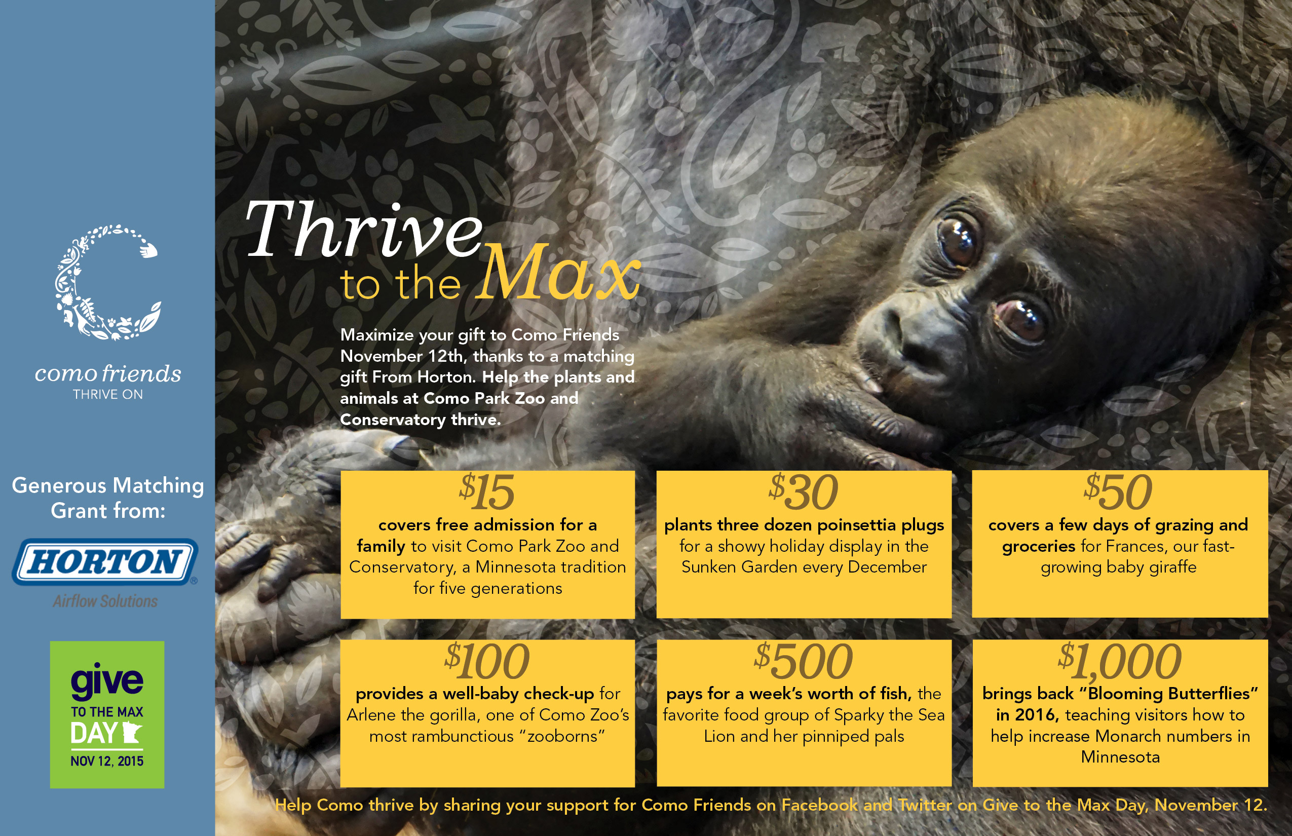
Operational efficiency improved alongside brand consistency. In the first year under the unified system, the organization’s Give to the Max Day campaign generated more than ten thousand dollars above the previous year’s total while requiring less staff time to execute.
Brand cohesion did not limit creativity. It focused it. Each event maintained its unique theme while clearly belonging to Como Friends.


